TRA IL 1988 E IL 2008 I 2/3 PIÙ POVERI DELLA POPOLAZIONE MONDIALE HANNO VISTO AUMENTARE I REDDITI FRA IL 40 E L’80%; IL DIECI PER CENTO PIÙ RICCO LI HA VISTI AUMENTARE FRA IL 30 E IL 60%; INVECE IL VENTI PER CENTO INTERMEDIO (DOVE SI COLLOCA LA CLASSE MEDIA OCCIDENTALE) HA VISTO UN AUMENTO NON SUPERIORE AL 10%
Il “Grafico dell’elefante” proposto dall’economista Branko Milanovic in un rapporto per la World Bank, poi ripreso in un articolo del New York Times, che aiuta a capire chi sono i vincenti e chi i perdenti della globalizzazione (una immagine più nitida del grafico si trova nella settima slide della relazione di Giorgio Tonini al convegno di LibertàEguale [1] svoltosi a Roma il 10 febbraio 2017) – Seguono una mia nota esplicativa del contenuto di questo grafico e un articolo pubblicato dal settimanale The Economist il 17 settembre 2016 .
.
NOTA ESPLICATIVA
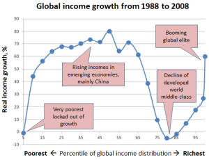
Nel grafico a forma di elefante, proposto dall’economista Branko Milanovic in una relazione del 2012, sull’asse orizzontale è indicata, dal primo al centesimo percentile (raggruppati cinque a cinque), la popolazione mondiale in ordine crescente di reddito; sull’asse verticale è invece indicato l’aumento del reddito registratosi, per ciascun gruppo di cinque percentili, dal 1988 al 2008.
Il diagramma mostra come si possa dividere la popolazione mondiale in quattro fasce, di cui due hanno tratto scarso o nullo beneficio dal ventennio della globalizzazione galoppante, mentre due ne hanno tratto grande beneficio. 1. La prima fascia è quella dei primi cinque percentili, dove si collocano i poverissimi, i quali non hanno visto alcuna crescita del proprio reddito. 2. La seconda fascia è quella in cui si collocano tredici gruppi di cinque percentili ciascuno: qui stanno dunque i due terzi più poveri – escluso il primo cinque per cento – della popolazione mondiale; in questa fascia il ventennio ha portato una crescita del reddito impressionante: dal 40 all’80 per cento. 3. La terza fascia è quella tra il settantesimo e il novantesimo percentile: quella in cui si collocava nel 1988, all’incirca, la classe media europea e americana e nel corso del ventennio ha incominciato a entrare anche la parte più ricca di quella cinese; qui nello stesso ventennio si è registrata una crescita molto bassa, non superiore al dieci per cento, e per due gruppi di cinque percentili addirittura una riduzione (rappresentata dai due pallini che si collocano al di sotto della linea della crescita zero: la parte bassa della proboscide dell’elefante). 4. La quarta fascia è quella in cui si colloca il dieci per cento che gode del reddito più alto: qui si torna a vedere nel ventennio una crescita del reddito, fra il trenta e il sessanta per cento, più accentuata via via che ci si avvicina al centesimo percentile; è la parte alta della proboscide.
L’articolo del settimanale britannico The Economist, riportato qui sotto, discute e chiarisce il significato di questi dati, avvertendo che i componenti di ciascun percentile sono in parte cambiati, nel corso del ventennio, proprio per effetto del differente tasso di crescita dei redditi illustrato dal grafico: in particolare, si registra l’ingresso di un notevole numero di cinesi nel gruppo del “nono decile”, che all’inizio del ventennio era composto quasi esclusivamente dalla classe media occidentale. Lo stesso articolo dà contro di un secondo grafico (riprodotto anche qui di fianco al testo) che illustra invece l’andamento, nel ventennio, del reddito degli appartenenti a ciascun percentile del 1988. Ne risulta una curva che ha all’incirca la stessa forma “elefantina”, ma con una proboscide più alta nel punto più basso e più bassa nel punto più alto. Il che significa che in realtà la classe media occidentale non ha complessivamente subito una vera e propria perdita di reddito nel corso del ventennio precedente alla greande crisi. Resta, però, il fatto che essa costituisce la parte della popolazione mondiale che da quel periodo ha tratto il beneficio minore, rispetto al resto del mondo. Cioè ha subito un impoverimento relativo.
SHOOTING THE ELEPHANT
The Economist, 17 settembre 2016
 The “elephant chart” began life in 2012, hidden in the middle of a World Bank working paper by Branko Milanovic, an authority on global inequality. It turned a few heads in the New York Times in 2014, then graced Mr Milanovic’s well-received book on global inequality earlier this year. Somewhere along the way it acquired its name, which helped it stampede across social media, brokers’ notes and even a ministerial speech this spring and summer. “I’m about to bring an elephant into the room. A wild, angry, and dangerous elephant,” joked Lilianne Ploumen, the Dutch trade minister, last month, before unveiling the chart to her audience. Now, its critics are trying to shoot it.
The distinctively shaped chart summarised the results of a huge number (196) of household surveys across the world. It was created by ranking the world’s population, from the poorest 10% to the richest 1%, in 1988 and again in 2008. At each rank, the chart showed the growth in income between these two years, an era of “high globalisation” from the fall of the Berlin Wall to the fall of Lehman Brothers.
When drawn for individual countries, charts of this kind tend to slant upwards (the rich gain more than the poor) or downwards. The global chart was unusual in sloping up, down, then upwards again, like an inverted S on its back, or an elephant raising its trunk. The chart showed big income gains at the middle and very top. But the era of globalisation seemed to offer little for the people in between: households in the 75th to 85th percentile of the income distribution (who were poorer than the top 15% but richer than everyone else) seemed scarcely better off in 2008 than they had been 20 years before. They constituted a decile of discontent, squeezed between their own countries’ plutocrats and Asia’s middle class. This dramatic dip in the chart seemed to explain a lot. “Cue Donald Trump. Cue nationalism. Cue Brexit,” wrote Mr Milanovic’s publisher.But who exactly occupies this dangerous decile? A report this week by Adam Corlett of the Resolution Foundation, a British think-tank, examines this group more closely, taking aim at some simplistic interpretations of the chart. Many people assume the chart shows how people in this controversial income bracket back in 1988 fared over the subsequent 20 years. But that is not quite the case. Instead it compares the people in this bracket in 1988 with people in the same bracket 20 years later. They may not be the same people. They may not belong to the same class. They may not even belong to the same country.
What accounts for the changing constituents of each income bracket? Fast growth will, of course, carry people up the income ranks. Data, dissolution and demography also play a part. The countries included in the 1988 and 2008 rankings differ because data did not exist for both years or because the country did not (several emerged only after the Soviet Union dissolved). In addition, faster population growth among people in the lower reaches of the income distribution will automatically shunt everyone above them further up the income ranks, even without any improvement in their fortunes.
To see why, imagine a simple world populated by 750m poor Southerners and 250m rich Northerners. Imagine that incomes do not change over the next 20 years, but the South’s population doubles. That would increase its share of mankind from 75% to over 85%. For that simple reason, in the 75th to 85th percentiles of the global income distribution poor Southerners would replace rich Northerners. Any comparison of this income bracket with the same bracket 20 years before would thus show a big decline in fortunes, even though no one is worse off.
In reality, better-off Latin Americans and Westerners of modest means dominated the 75th-80th percentiles of the global income distribution in 1988. By 2008, rich Chinese had encroached upon this income bracket. The flat incomes shown by the elephant chart do not, then, reflect the stagnant fortunes of Trumpians and Brexiteers. They instead reflect a comparison between the original Latin American and Western occupants of this income bracket and the Chinese who jumped into it 20 years later.
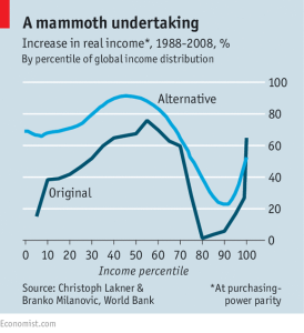 None of this will be new to readers of Mr Milanovic’s academic work. He and his co-author, Christoph Lakner, were quite clear about the shifting composition of the troublesome deciles. Their journal article also included an alternative chart, which does what many people assumed the elephant chart had done: it illustrates how each income group in each country in 1988 fared over the subsequent 20 years. In its shape, the chart looks recognisably elephantine. But the top 1% do markedly less well in this alternative chart than in the more famous one, and even the worst performing groups (now around the 90th percentile) boast income growth of 20% or more over 20 years.
Both charts show that China’s middle classes and the world’s rich have gained handsomely in the era of globalisation. It also remains true that the lower middle classes in rich countries have fared less well. The elephant shape remains, even if its dimensions are different. The Resolution Foundation’s critique added little to the original academic papers (except a reason to go back and read them). But it clarified a misunderstanding shared by many of the pundits and drumbeaters who made such a noise about the rampaging chart. Like the elephant George Orwell described in a famous essay about his time as a colonial policeman in Burma, this one was shot chiefly to silence a crowd.
.